Adding the ability to zoom within the XamDataGrid has the following requirements.
- The XamDataGrid cells and column headers must scale to match the current zoom value.
- There must be an editable combo box that contains the current zoom value.
- The editable combo box must reside in the horizontal scrollbar on the right side.
- Ctrl + mouse wheel must zoom in and out by a set percentage when the mouse is within the boundaries of the XamDataGrid.
MouseWheelZooming Attached Properties
I like using attached properties to tack functionality onto already existing controls. It's quick, easy, and malleable. For this feature addition, I need the control to maintain a zoom value, as well as automatically increase/decrease that value on mouse wheel events. For this, I created a MouseWheelZooming class to house the necessary attached properties.
A IsEnabledProperty will determine if the zooming is in use, attaching event handlers when enabled and changing the zoom values when the wheel events occur. The following code is the implementation for the IsEnabledProperty.
A IsEnabledProperty will determine if the zooming is in use, attaching event handlers when enabled and changing the zoom values when the wheel events occur. The following code is the implementation for the IsEnabledProperty.
public static readonly DependencyProperty IsEnabledProperty = DependencyProperty.RegisterAttached("IsEnabled", typeof(bool), typeof(MouseWheelZooming),
                                                                                                          new FrameworkPropertyMetadata(false)
                                                                                                          {
                                                                                                              PropertyChangedCallback = ZoomEnabledChanged,
                                                                                                              BindsTwoWayByDefault = true
                                                                                                          });
public static bool GetIsEnabled(DependencyObject item)
{
    return (bool)item.GetValue(IsEnabledProperty);
}
public static void SetIsEnabled(DependencyObject item, bool value)
{
    item.SetValue(IsEnabledProperty, value);
}

private static void ZoomEnabledChanged(DependencyObject s, DependencyPropertyChangedEventArgs args)
{
    Control c = (Control)s;
    bool wasEnabled = (bool)args.OldValue;
    bool isEnabled = (bool)args.NewValue;

    if (wasEnabled)
        c.RemoveHandler(Control.PreviewMouseWheelEvent, new MouseWheelEventHandler(PreviewMouseWheel));

    if (isEnabled)
        c.AddHandler(Control.PreviewMouseWheelEvent, new MouseWheelEventHandler(PreviewMouseWheel), true);
}

private static void PreviewMouseWheel(Object sender, MouseWheelEventArgs e)
{
    if (Keyboard.Modifiers == ModifierKeys.Control)
    {
        Control zoomableControl = (Control)sender;

        double zoomAmount = (double)zoomableControl.GetValue(ZoomAmountProperty);
        double zoomMinimum = (double)zoomableControl.GetValue(ZoomMinimumProperty);
        double zoomMaximum = (double)zoomableControl.GetValue(ZoomMaximumProperty);

        if (e.Delta > 0)
            zoomAmount *= 1.1;
        else
            zoomAmount *= 0.90909090909090906;

        if (zoomAmount > zoomMaximum)
            zoomAmount = zoomMaximum;
        else if (zoomAmount < zoomMinimum)
            zoomAmount = zoomMinimum;

        zoomAmount = Math.Round(zoomAmount, 2);

        zoomableControl.SetValue(ZoomAmountProperty, zoomAmount);
    }
}
Note that this code references ZoomAmountProperty, ZoomMinimumProperty, and ZoomMaximumProperty. These are additional attached properties in my MouseWheelZooming class, but the declarations are omitted here because they are strictly boiler plate.That's it. I now have my zoom value, which is also automatically changed by the mouse wheel. Now I just need to hook up the zoom value to the control scaling.
LayoutTransform
As mentioned, I used the LayoutTransform to perform all scaling. All FrameworkElements have two types of transforms.
- LayoutTransform - This transform is applied before the layout pass. The layout system will work with the transformed size and location when laying out the UI.
- RenderTransform - This transform is applied after the layout pass but before the render. Ideal when changes are independent of the rest of the UI because of performance gains.
I use the LayoutTransform because the size changes need to remain sensible within the UI. For example, scaling a grid to 200% shouldn't overlap other items in the UI. Instead, it should expand as far as it's parent allows, and then expose scrollbars if the size exceeds the allowed space. The LayoutTransform provides this functionality.
The transform used to achieve the scaling is a very simple one. It's just a ScaleTransform that uses a common value for the ScaleX and ScaleY to provide fixed ratio scaling. The only problem is that we're using XamDataGrid, which is a bit more sophisticated than more controls. We can't just scale XamDataGrid and expect everything to come out nicely.
Scaling XamDataGrid
When scaling is applied directly to XamDataGrid you end up with scrollbars that scroll the column headers with the cells. All data grid implementations I'm familiar with scroll only the rows, and the column headers remain static at the top of the view. Having scrolling headers is terrible experience for end users. The scaling has to be done at a deeper level within XamDataGrid.
To get proper grid scaling, the column headers and cells need to be scaled independently so that the layout logic will continue to function as designed (leaving the headers at the top). Luckily, this is possible though the use of styles. The XamDataGrid lets you set the style for various components within the grid through FieldLayoutSettings. This class has two properties on it that we'll use.
- DataRecordCellAreaStyle - The style applied to each record's cell area.
- HeaderLabelAreaStyle - The style applied to the header's label area.
By applying scaling through these styles, I can change the size of the inner components of the grid and still allow the grid's layout logic to work normally, giving correct functionality when scrolling is necessary (the headers will not scroll). Both properties can use the same style.
<Style x:Key="ZoomTransform" TargetType="{x:Type Control}">
    <Setter Property="LayoutTransform">
        <Setter.Value>
            <ScaleTransform ScaleX="{Binding RelativeSource={RelativeSource AncestorType=igData:XamDataGrid}, Path=(vibrantUiWpf:MouseWheelZooming.ZoomAmount)}"
                                            ScaleY="{Binding RelativeSource={RelativeSource AncestorType=igData:XamDataGrid}, Path=(vibrantUiWpf:MouseWheelZooming.ZoomAmount)}" />
        </Setter.Value>
    </Setter>
</Style>
This style uses relative binding to reach up to the parent XamDataGrid and obtain the zoom amount. Recall that ZoomAmount is the attached property I created, which is why the syntax for the path is different than typical path syntax. Now when creating a XamDataGrid, the FieldLayoutSettings can be set as such.<igData:XamDataGrid.FieldLayoutSettings>
<igData:FieldLayoutSettings DataRecordCellAreaStyle="{StaticResource ZoomTransform}" HeaderLabelAreaStyle="{StaticResource ZoomTransform}" />
</igData:XamDataGrid.FieldLayoutSettings>
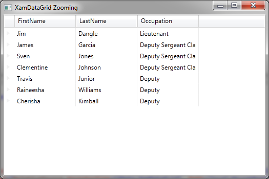
The XamDataGrid can now be zoomed with the crtl+mouse wheel, or by setting the value of the ZoomAmount attached property. |
| XamDataGrid at 50% |
 |
| XamDataGrid at 100% |
 |
| XamDataGrid at 200% |
ScrollViewer with ComboBox
With the zooming now functional, all that remains is displaying the current zoom value in the UI. Recall from #2 and #3 from the 4 requirements. To achieve this, I need a combo box that will reside adjacent to the horizontal scrollbar. The XamDataGrid is built with a ScrollViewer, so to customize this, I created a ControlTemplate for a ScrollViewer that includes the combo box.
<ControlTemplate x:Key="ZoomableScrollViewer" TargetType="ScrollViewer">
<ControlTemplate.Resources>
<Style TargetType="ScrollViewer" />
</ControlTemplate.Resources>
<Grid Background="{TemplateBinding Background}" Tag="{Binding}">
<Grid.ColumnDefinitions>
<ColumnDefinition Width="Auto"/>
<ColumnDefinition Width="*"/>
<ColumnDefinition Width="Auto"/>
</Grid.ColumnDefinitions>
<Grid.RowDefinitions>
<RowDefinition Height="*"/>
<RowDefinition Height="Auto"/>
</Grid.RowDefinitions>
<ScrollBar
x:Name="PART_VerticalScrollBar"
Grid.Column="2"
Minimum="0.0"
Maximum="{TemplateBinding ScrollableHeight}"
ViewportSize="{TemplateBinding ViewportHeight}"
Value="{Binding RelativeSource={RelativeSource TemplatedParent}, Path=VerticalOffset, Mode=OneWay}"
Visibility="{TemplateBinding ComputedVerticalScrollBarVisibility}"
Cursor="Arrow"
AutomationProperties.AutomationId="VerticalScrollBar"/>
<ScrollBar
x:Name="PART_HorizontalScrollBar"
Orientation="Horizontal"
Grid.Row="1"
Grid.Column="1"
Minimum="0.0"
Maximum="{TemplateBinding ScrollableWidth}"
ViewportSize="{TemplateBinding ViewportWidth}"
Value="{Binding RelativeSource={RelativeSource TemplatedParent}, Path=HorizontalOffset, Mode=OneWay}"
Visibility="Visible"
Cursor="Arrow"
AutomationProperties.AutomationId="HorizontalScrollBar"/>
<local:EditableComboBox Width="50" Grid.Column="0" Grid.Row="1" IsEditable="True" FontSize="11" Padding="0"
Text="{Binding RelativeSource={RelativeSource AncestorType=igData:XamDataGrid}, Path=(local:MouseWheelZooming.ZoomAmount),
Mode=TwoWay, UpdateSourceTrigger=Explicit, Converter={StaticResource PercentageConverter}, ConverterParameter=%}">
<local:EditableComboBox.ItemsSource>
<x:Array Type="{x:Type sys:Double}">
<sys:Double>20</sys:Double>
<sys:Double>50</sys:Double>
<sys:Double>70</sys:Double>
<sys:Double>100</sys:Double>
<sys:Double>150</sys:Double>
<sys:Double>200</sys:Double>
<sys:Double>400</sys:Double>
</x:Array>
</local:EditableComboBox.ItemsSource>
<local:EditableComboBox.ItemTemplate>
<DataTemplate>
<TextBlock>
<TextBlock.Inlines>
<Run Text="{Binding Mode=OneWay}" />
<Run Text="%" />
</TextBlock.Inlines>
</TextBlock>
</DataTemplate>
</local:EditableComboBox.ItemTemplate>
</local:EditableComboBox>
<ScrollContentPresenter
x:Name="PART_ScrollContentPresenter"
Grid.ColumnSpan="2"
Margin="{TemplateBinding Padding}"
Content="{TemplateBinding Content}"
ContentTemplate="{TemplateBinding ContentTemplate}"
CanContentScroll="{TemplateBinding CanContentScroll}"/>
<Rectangle
x:Name="Corner"
Grid.Column="2"
Grid.Row="1"
Fill="{DynamicResource {x:Static SystemColors.ControlBrushKey}}"/>
</Grid>
</ControlTemplate>
I created this ControlTemplate from the default template for ScrollViewer. The main change is that I added the EditableComboBox to the grid layout (line #37). Note the relative source binding. This will enable the combo box to stay in sync with the current zoom value. I couldn't find a direct way to set this ControlTemplate with XamDataGrid, so I instead used a style to set the template.
<Style TargetType="igData:RecordListControl">
    <Style.Resources>
        <Style TargetType="ScrollViewer">
            <Setter Property="Template" Value="{StaticResource ZoomableScrollViewer}" />
        </Style>
    </Style.Resources>
</Style>
This will set my ControlTemplate on any ScrollViewer within the RecordListControl, which is the control used by XamDataGrid. That's all that is needed. The combo box will now display in the bottom corner.

No comments:
Post a Comment